
Navigating to Timeseries
Select Timeseries from the sidebar menu.
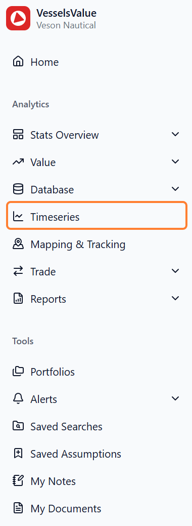
Overview of the navigation within Timeseries
Our Timeseries product is broken up into three areas, as shown in the side navigation:
-
Your charts
-
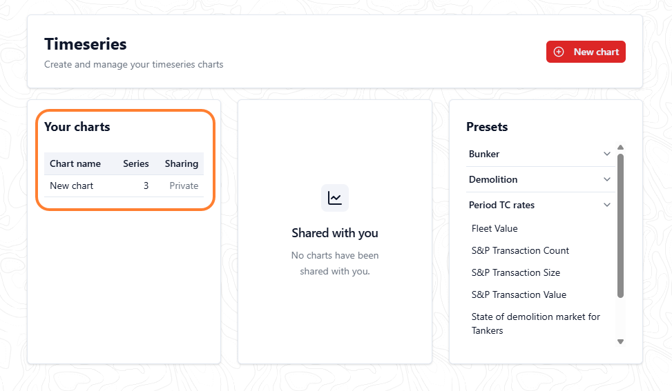
You will land in this area by default
-
This is where all of the charts you create will be stored
-
-
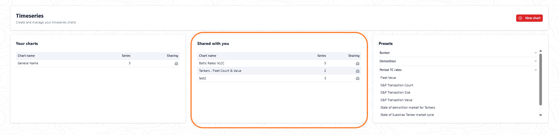
Shared with you
-
This is where any charts shared with you by other colleagues in your company will be accessible
-
-
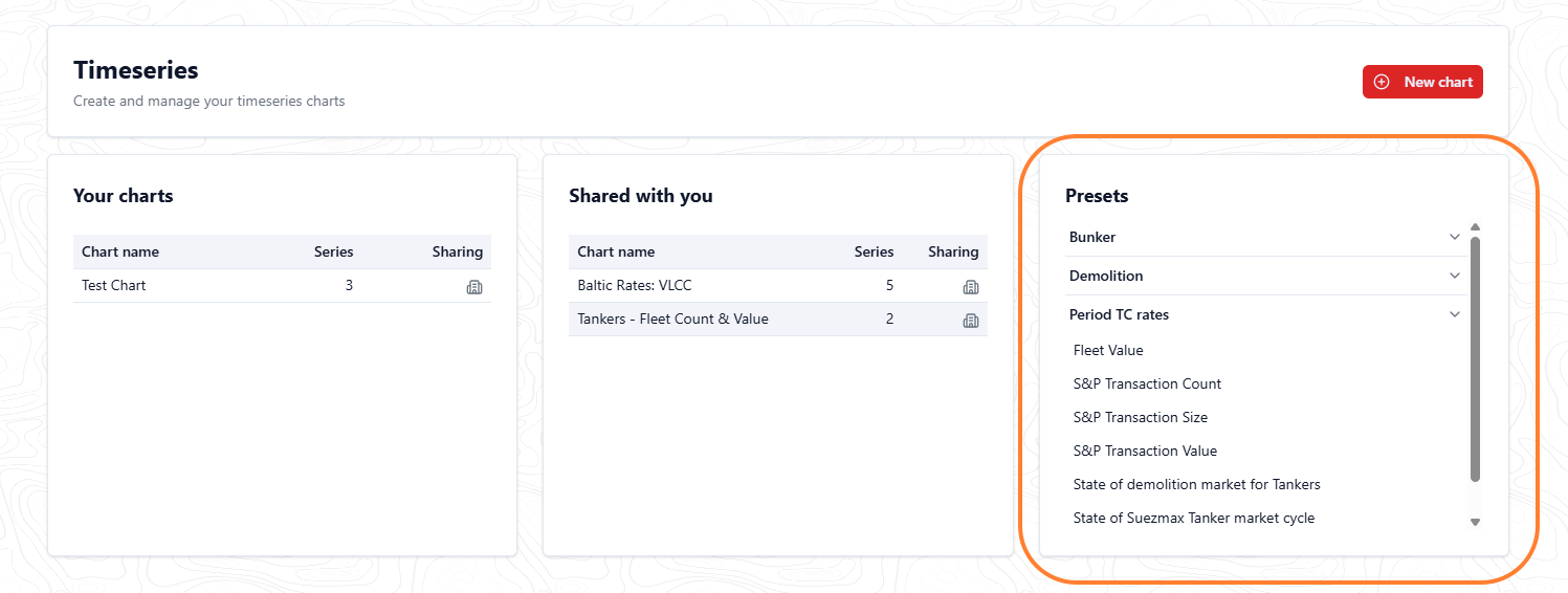
Presets
-
This is where pre-configured charts by VesselsValue will be shared with you
-
Building a new chart
Create a new chart
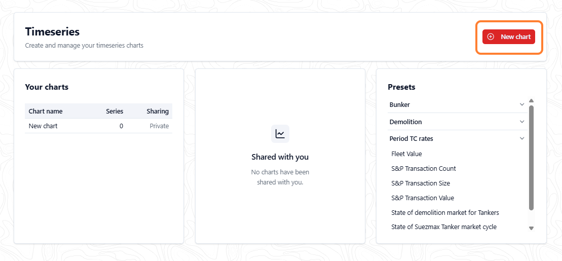
To create a new chart, select New chart.
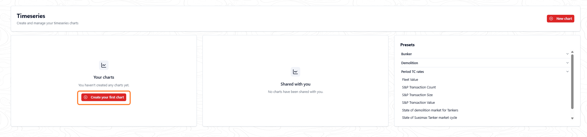
Alternatively, if you haven’t created a chart yet, you will be greeted with a prompt to create your first chart. Select the Create your first chart button to get started.
Naming your chart
Once you select one of the create new chart options, you will be prompted to name your chart. Fill in the name you’d like and select the Create button to continue.
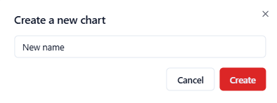
Once you name your chart, you’ll enter what we will refer to as edit mode. This is where you can begin to build your bespoke chart.
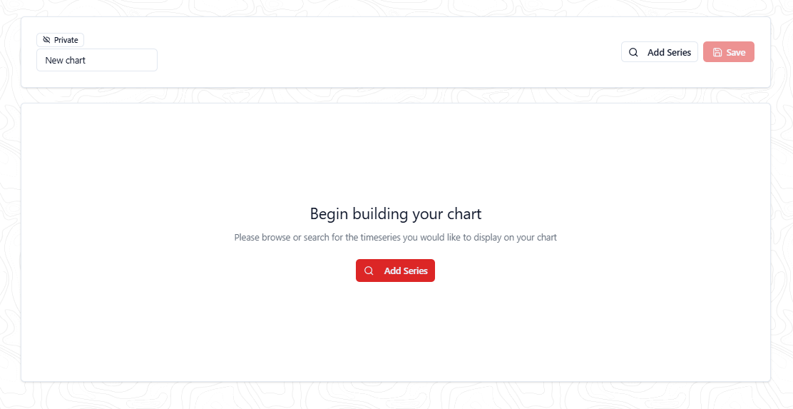
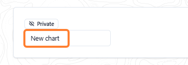
If you ever change your mind about the name of your overall chart, you can amend it in the input in the upper left of the page:
Browsing Timeseries to Add to Your Chart
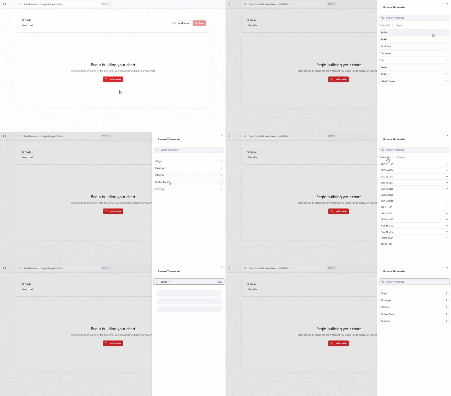
To browse the available timeseries, go to the panel next to the side navigation, as shown in the following screenshot.
We have two ways to browse our data: through the groups shown in the following screenshot (that is, Cargo, Passenger, and a search bar). We’ve categorised our timeseries by vessel type and then data type to allow you to navigate to the data you’re interested in.
-
If you would like to navigate back through the groups, use the breadcrumb links shown above the groups to jump back up. The bold black text indicates the folder you’re within.
-
Alternatively, you can search for the timeseries you’re after using the search bar at the top.
Groups are shown in black text with red chevrons, and individual timeseries, which can be added to the chart, show plus icons.
Adding time series to your chart
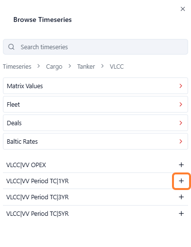
Navigate through the groups or search for the series you’re interested in and then press the ➕ icon to add them to the chart.
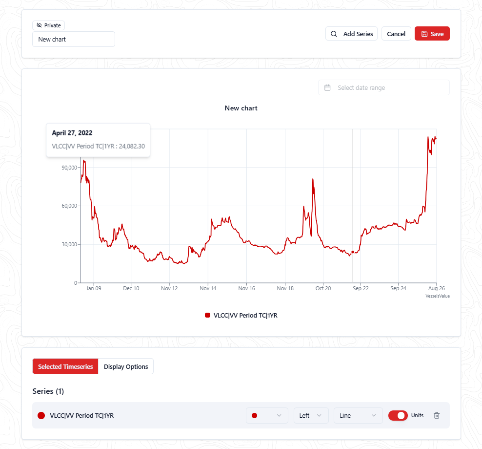
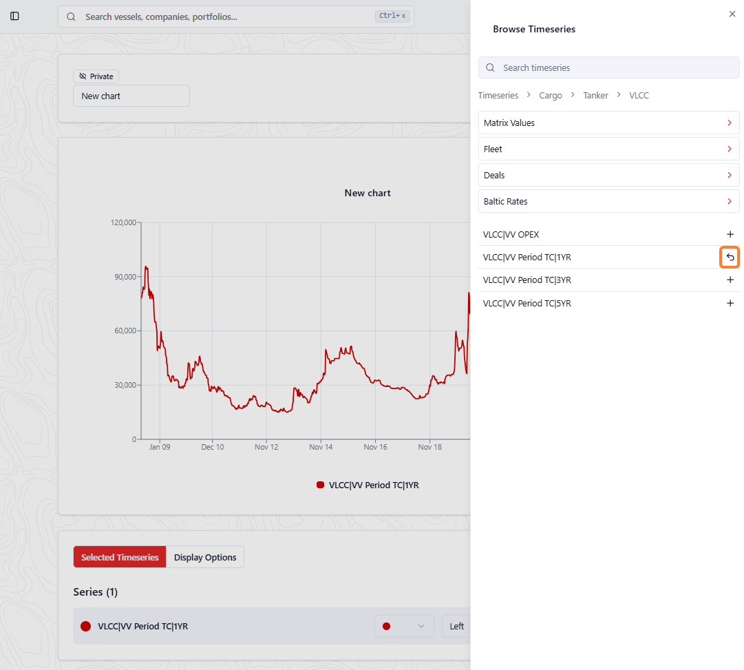
Removing series from your chart
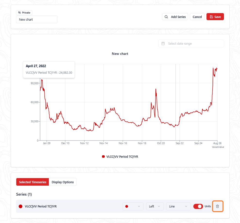
If you’ve mistakenly added a time series to your chart and you’d like to remove it, then you can either use the undo icon 
Alternatively, select the bin icon next to remove the data set.
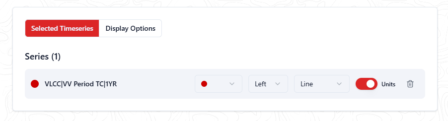
Customising your selected series
Once you have added series to your chart, you will see them being displayed in the “selected timeseries” section. Here you can change:
-
Color option: The colour of each individual series from our range of predefined colours
-
Left or right: The axis they’re being displayed on (left or right)
-
Line or column: The type of chart displayed
-
Units toggle: Whether to show the units on the chart labels or not
Series colour
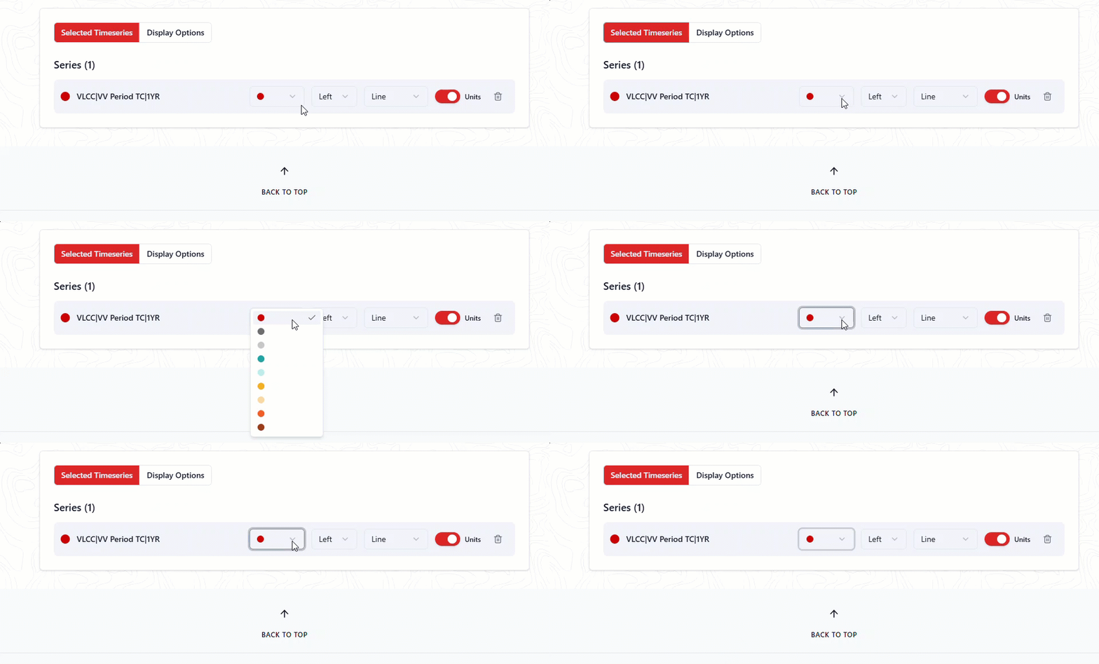
To change the colour of each individual series, select the dropdown on the left side and choose from a selection of nine colours.
Axis
We offer the ability to choose which axis you would like each time series to display to support the unit differences across our time series. Currently, we only support left and right-axis options. The left axis will be chosen by default for all series.
To change which axis a series is displaying on, select the Y-axis: Left dropdown and select your preference:
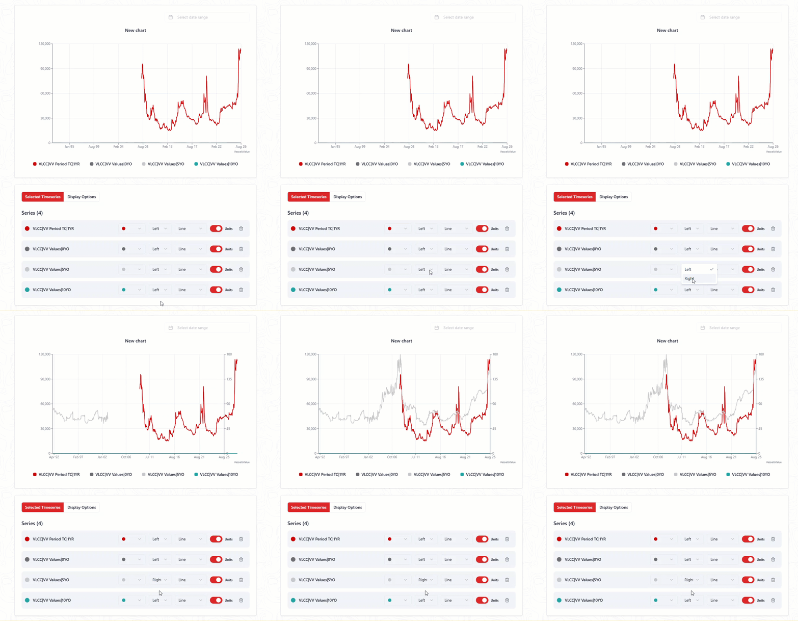
Chart name
To customise the chart for your needs, we support the ability to change the name being displayed for each time series. By default, it will be the name we have given the series.
To change the name being shown, edit it in the input field and it will automatically update on the chart above.

Chart type NEW
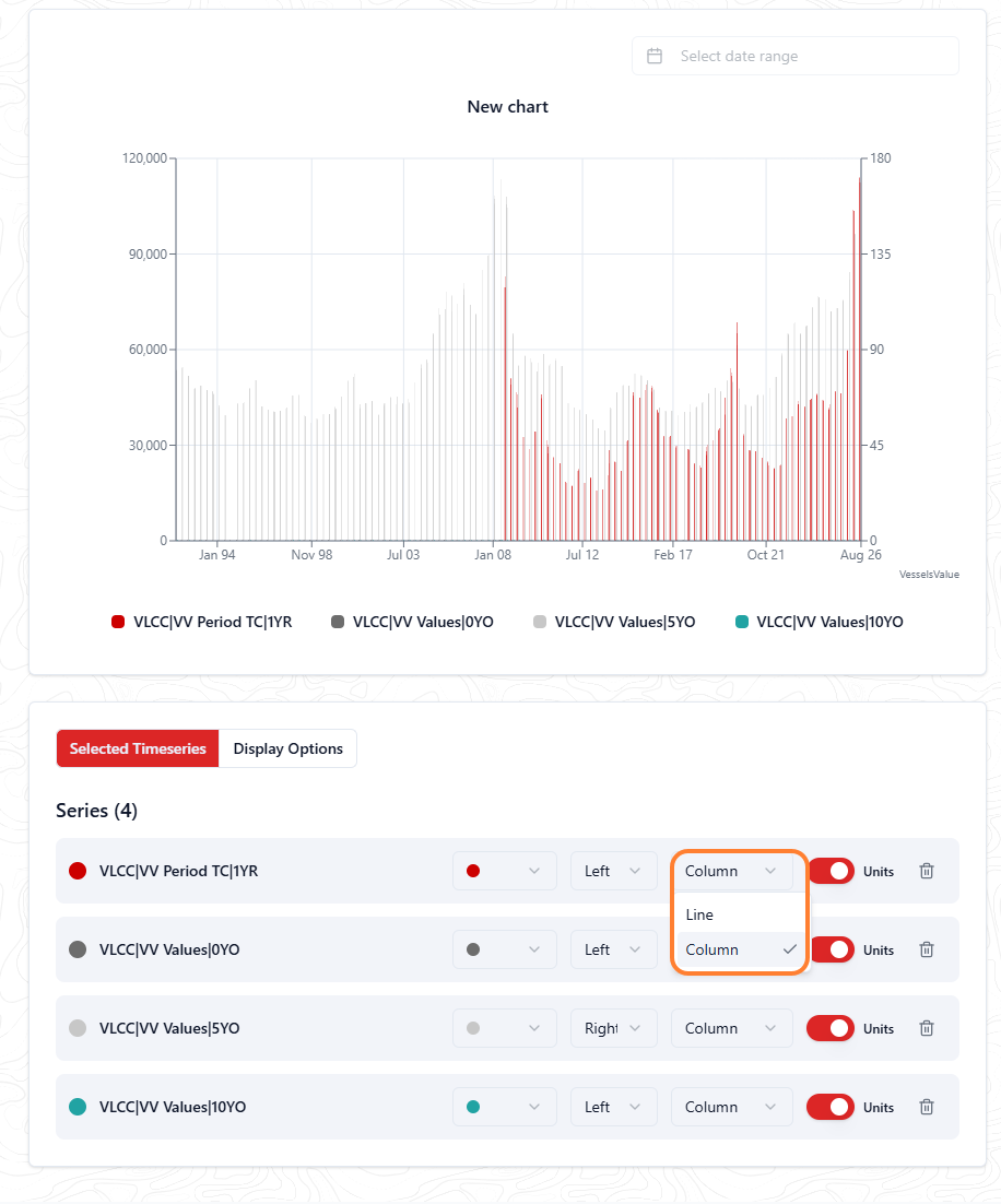
You can change the chart type to a display as a line or column.
Units
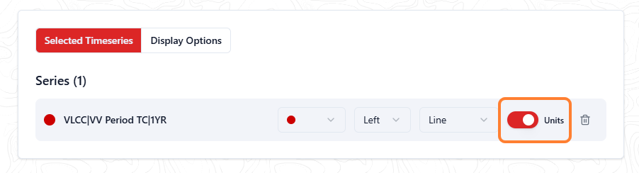
We offer the ability to choose whether you’d like the units visible for each series on the end of the time series label or not. Each series will default to having their units appended to the name.
To change whether the units are appending to the end of the time series label, select or deselect the checkbox.
Edit the chart display options
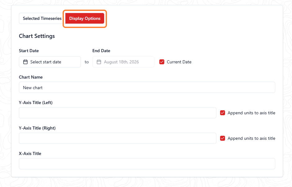
Once you have put the finishing touches on your selected time series, you can now configure the rest of your chart in the Display Options section. Here you can change the following:
-
The start and end date that the chart will display by default
-
The chart name
-
Y-axis title (left and right)
-
X-axis title
Start and end dates
We offer the ability to choose what date range you would like your chart to show. Whenever you visit your chart, this is the date range that will be shown. By default, the chart will select the date range taken from the first series added to your chart up until the current date.
To amend the start date, select the first input and select the date from the calendar picker.
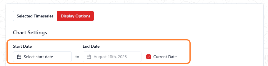
To amend the end date, you have two options:
-
Select your own date by deselecting the current date checkbox and choosing a date using the end date calendar picker
-
Select the current date to keep your chart up to date with daily added data
Chart title
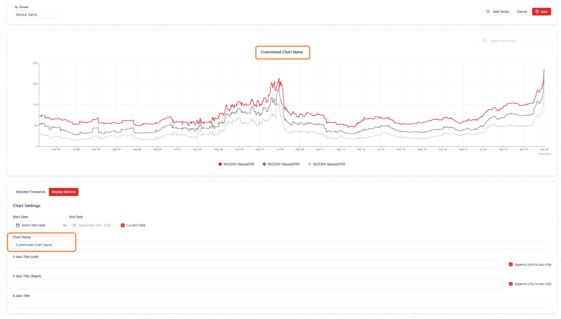
We offer the ability to edit the title shown on the chart, allowing users to customise the chart fully for their purposes. By default, it will be the name you gave your overall chart at the very beginning.
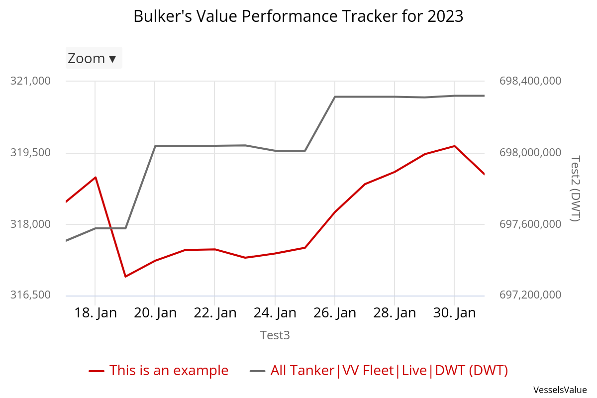
You may ask, why would we allow this ability? We received feedback from our clients that they’d like to be able to change the chart title to be more detailed when producing charts for presentation and reporting purposes. Here’s an example of this:
-
Overall chart name: All Bulker’s value
-
This is short and concise, allowing you to summarise your chart
-
-
Chart title: Bulker’s Value Performance Tracker for 2023
-
This is more detailed, allowing you to specify what you’re using this chart for
-
Axes title(s)
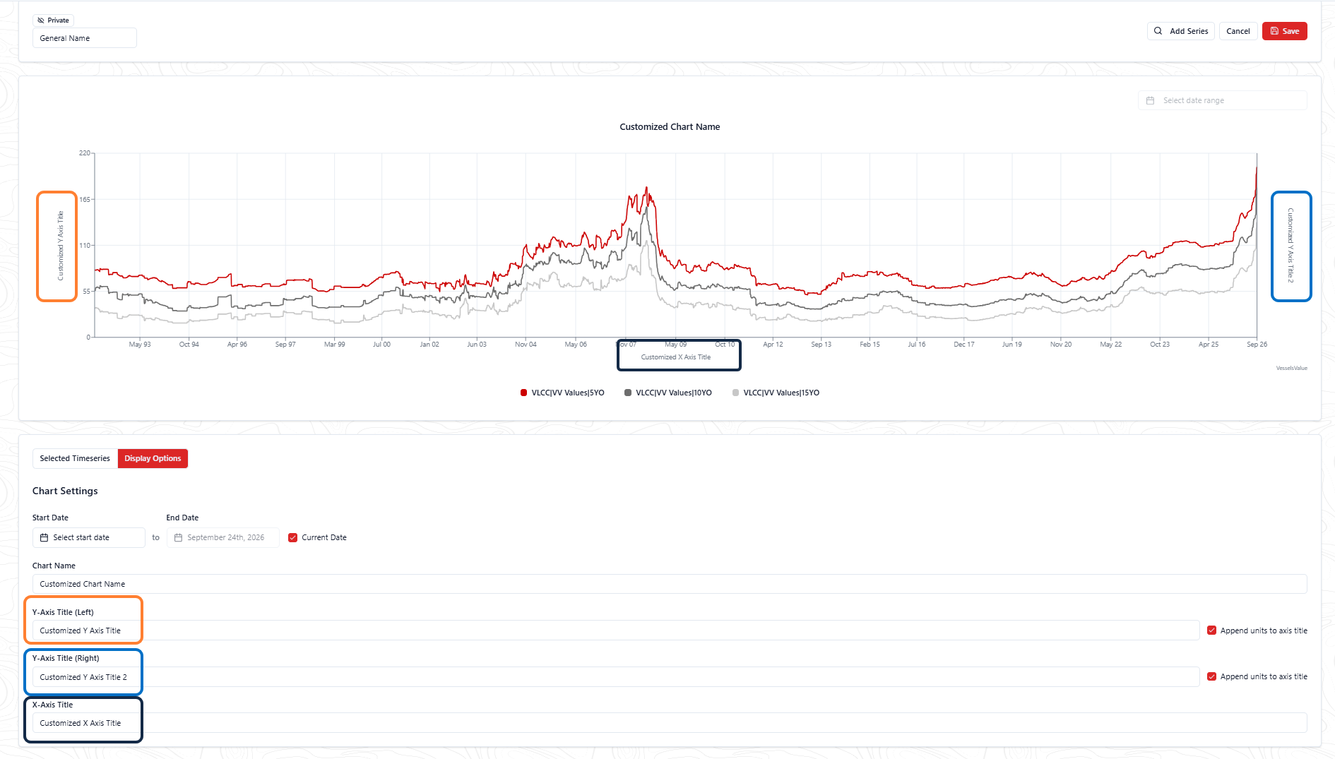
We offer the ability to edit the names of the titles shown on the X and Y-axes. If you have selected a series to be shown on the left and right axes, then both titles are available for customisation. By default, these will be blank with the append units checkboxes selected for each series.
Save your chart
Once you have finished configuring your chart, simply navigate and select the Save button in the upper right corner:
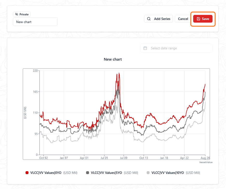
This will now save your chart and display it in the Your charts area so you can revisit it:
Breakdown Tables
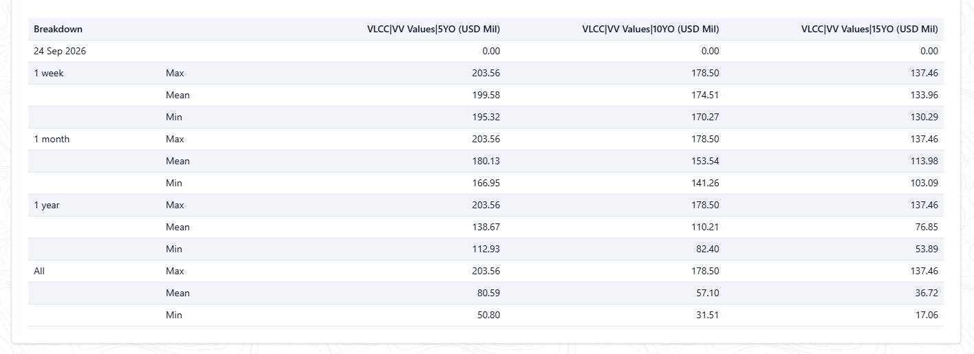
In saved mode, use the breakdown tables to support your visualised chart. It will help to summarise the data as max, mean and min values, by week, month and year. These are located under each timeseries and display automatically when the data is loaded.
Edit an existing chart
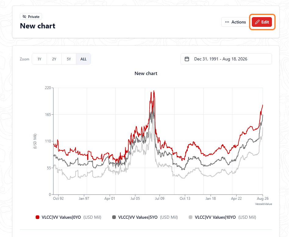
If you would like to edit your chart to amend any of the above, select the Edit button at the top, which will put your chart back into edit mode.
Shared with you section
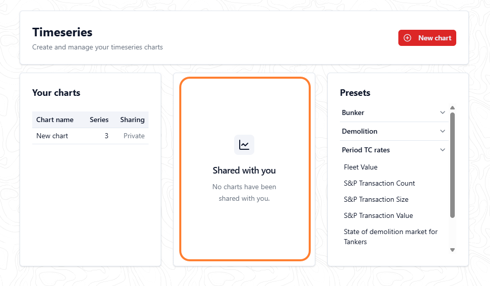
To allow our subscribers to work collaboratively with one another, we allow you to share charts you’ve created with one another. Once you do this, they’ll show up in the Shared with you section as shown.
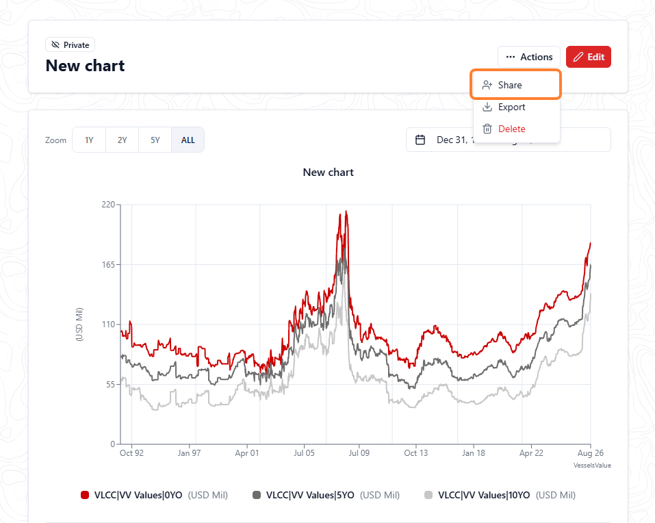
To share a chart, go to Actions in the upper right and choose Sharing from the dropdown list.
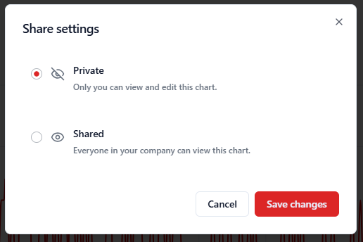
Select from the following sharing options:
-
Private: only you can view and edit this chart
-
Shared: everyone in your company can view and edit this chart
-
Optional checkbox: allow edit access for everyone at your company
-
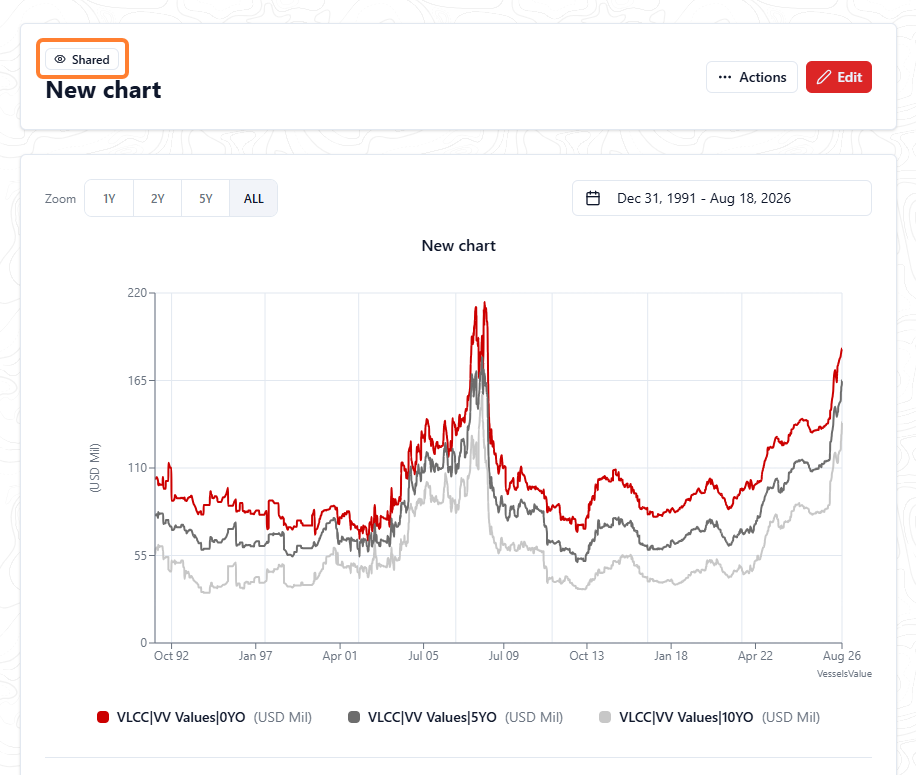
Once you have changed your chart to be shared, this will be indicated next to the chart name. By hovering over the red eye 
Now you’ve shared a chart with your colleagues it will show up in their Shared with you area. If you have set it for viewable only, then it’ll show as below for your colleague:
Presets section
Our Presets area aims to give our clients an overview of the market and useful series using our Timeseries core data, saving clients from creating these charts themselves.
For the launch of our Timeseries product, the charts in this area will replicate those originally from the Market page. Our Market page will be discontinued shortly after this product launches.
Charts included in this area will contain data such as:
-
Bunker prices
-
Demolition prices
-
Fleet Values
-
Period TC rates
-
S&P transaction counts and sizes
Additional functionality
Export
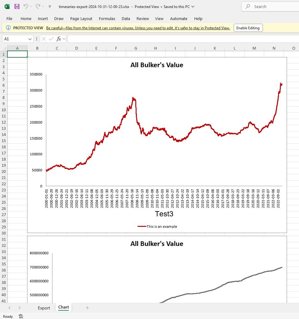
If you subscribe to our export module, you can export your charts using the Export button at the top of the page.
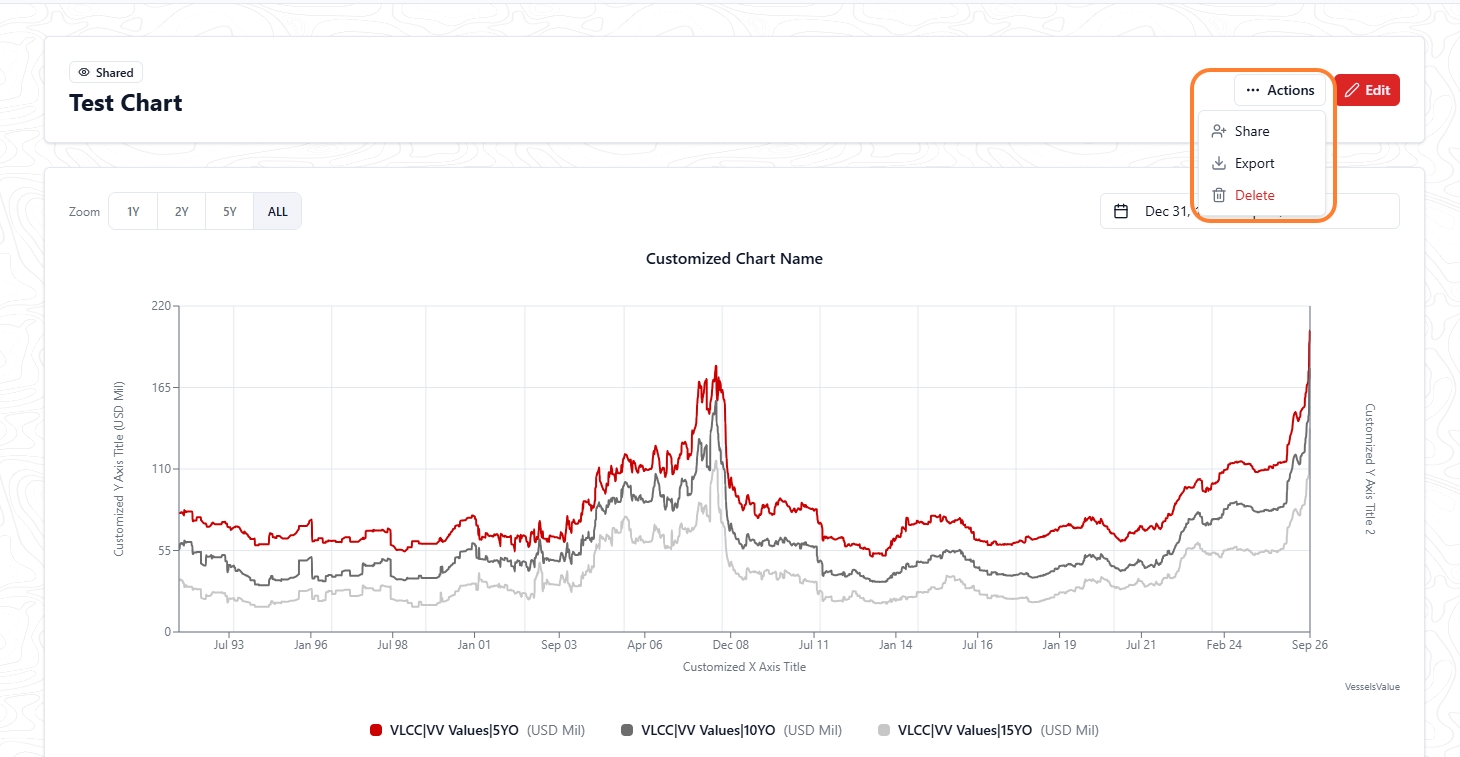
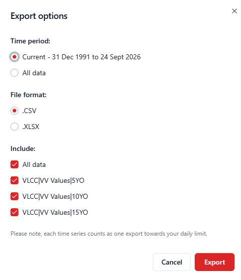
This will trigger a pop-up presenting the options available to the user.
The configuration options are:
1. Time periods
-
Current
-
This is the date range you chose to display on your chart in the display options when building it
-
Note this is not the date range from the date pickers when viewing the saved chart
-
-
All data
-
This will export the full date range we have available in the time series on your chart
-
An example is: if you selected one of our values timeseries, which has data from 1992 to today’s date but have chosen to view 1st January 2022 to today’s date only on your chart, you’d receive the full 1992 to today's date range.
-
2. File format:
-
.CSV
-
This will provide a CSV with all the series data points in
-
-
.XLSX
-
This will provide an XLSX with all the series data points in
-
This option also includes a pre-built Excel chart using the series data points in a separate tab, allowing you to get reporting or analysing faster
-
-
Image
-
This will provide a PNG export of the configured chart
-
Note, this is only available for the current time period option
-
3. Data to be included:
-
All data checkbox
-
This will include every timeseries you have selected in the export
-
-
Each individual timeseries checkbox
-
This allows you to customise the series which you’d like to include in the export
-
To export, you need to configure the options above and then select the Export button. Once complete, it’ll download it to your device in your selected format.
Limitations to be aware of
-
Exports are limited to the number of series being exported per day
-
The default is 10 series per day
Please speak with your Account Manager if you have any questions.